Technical Analysis
“…technical analysis makes use of various analytical tools and charts of price movements to evaluate a security’s strength or weakness.”
When it comes to its method of security evaluation, technical analysis can be seen as the opposite of Fundamental Analysis. Unlike fundamental analysis, which attempts to evaluate a security’s intrinsic value, technical analysis makes use of various analytical tools and charts of price movements to evaluate a security’s strength or weakness. The key difference is in how technical analysis relies less on the intrinsic value of a security, and more on its history (past trading activity and price changes).
1) The Basics
To put it simply, technical analysis is the study of supply and demand in a market in order to determine the direction in which a trend will continue in the future. By studying the market on the whole as opposed to its individual components, technical analysis allows a trader to understand the emotions and psychology that influence a market’s movement. The principal philosophy of technical analysis is a focus on historical price and volume data instead of a security’s intrinsic value.
2) Underlying Assumptions
It is important to identify the three underlying assumptions that are made when it comes to technical analysis. These are the cornerstones of technical analysis, and understanding them will allow you to make informed decisions when it comes to you trades.
-
Asset Price Discounts Everything Else
This assumption suggests that everything that has affected, or could affect an asset is already reflected in its price. Technical analysis believes that the factors which affect a company, like macroeconomic factors and market psychology, are all reflected in the price of its stock. All that is needed, then, is an analysis of price movement, which technical analysis views as a product of supply and demand for any given stock in the market.
-
An Established Price Will Continue in a Trend
Technical analysis believes trends in price changes are systematic and not random. This leads to the notion of market trends, both in the short and long term, being indicative of whether or not an investment will reap returns. Once a price trend has been established, technical analysis suggests that it is likely to continue moving in the same direction.
-
History Repeats Itself
Another key assumption of technical analysis is that traders tend to react in the same way when confronted by similar market conditions. This is due to market psychology, where participants in a market, over time, typically demonstrate a consistent series of decisions in the face of similar market events. This is what makes market charts that have been used for decades still relevant as a means of reflecting patterns in price movements.
3) How is Technical Analysis Used?
Technical analysis can be used to forecast nearly all tradable instruments that are typically subject to forces of supply and demand. This includes stocks, bonds, futures, and currency pairs. Technical analysis is typically applied to changes in market price, although some analysts are interested also in factors such as trading volume or open interest figures.
Candlestick Charting
This method of technical charting was first conceived back in the 1700s by a Japanese man named Homma, a trader in the futures market. Candlestick charting is based off Homma’s understanding that the relationship between the price and the supply and demand of markets is strongly influenced by the emotions of traders. Today, Homma’s principles are still highly relevant, and candlestick charting is used by many traders to measure how market emotions influence a stock.
1) Components
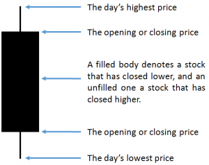
When looking at a candlestick chart, it is important to pay attention to the candlestick line which denotes the market’s open, high, low and close of a given day. This is represented in Figure 1 on the right.
As you can see, the candlestick has a wider segment in the middle of the line. This is referred to as the “body,” which denotes the range between the opening and closing prices of the day’s trading. A filled body, like in Figure 1, means the close of the day was lower than its open. If it is empty, or blank, it means the contrary, that the close of the day was higher than its open.
The thinner lines above and below the “body” are the “shadows” of the candlestick. These denote the high and low prices of that day’s trading. A short upper shadow on a blank or unfilled body tells us that the close was near the high, and vice versa. As such, the appearance of the candlestick is determined by the open, high, low and close of the day.
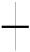
2) Doji Candlesticks
Like the candlestick pattern in the previous point, the doji (shown in Figure 2) has four sets of data which determines its shape: the open, high, low and close. A doji occurs when the opening and closing price of a stock is almost identical, giving it the appearance of a cross. This denotes a situation where both buyers and sellers in a given market are matched similarly, thus resulting in a near stagnant price. Many analysts interpret this frozen price as a sign of a reversal pattern. This, however, is an overly-simplified perspective, for it also possible that the doji denotes a point in time when buyers and sellers are setting up for a continuation trend.
3) Hammer
In technical analysis terms, a hammer refers to a price pattern in candlestick charting that arises when a security trades much lower than its opening, but rallies, or demonstrates a sustained increase in price, later in the day, resulting in a close than is either higher or at its opening price. Typically, a hammer candlestick occurs after a security has been declining, demonstrating the possibility that the market is attempting to determine a bottom.

4) Shooting Star
The inverse of a hammer candlestick is sometimes referred to as a shooting star (Figure 3), a candlestick formation that occurs when a security’s price increases far above the opening price at some point during the day, but closes lower than the opening price. Shooting stars indicate potential price tops and reversals. It is the result of buyers getting impatient waiting for a pull back as a price rises, which leads to them trying to outdo each other by buying up shares. This buying frenzy eventually hits a peak, marking the highest high of the preceding series of candles.

5) Resistance and Support
The concepts of resistance and support are probably two of the most widely discussed factors of technical analysis. Resistance and support levels are lines on a price graph at which prices of an asset are expected to bounce back after a decline (the support level), or reverse after an increase (the resistance level).
If you look at Figure 4 on the right, you will see two rows of dotted lines. The top one represents the resistance level, and the bottom one represents the support level.
When it comes to FX Derivatives strategy, it is optimal for traders to place a call option on an asset as it hits a support level, or a put option as it approaches resistance.
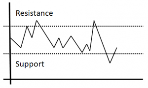
Chart Patterns
Chart patterns allow traders to gain perspective on the markets by consolidating all the forces of supply and demand into a singular, concise picture. As a complete pictorial record of all trading, chart patterns provide a framework to analyze the relationship between bull and bear forces. More importantly chart patterns and technical analysis can help traders identify whether a market is bullish or bearish, allowing traders to position themselves accordingly.
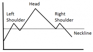
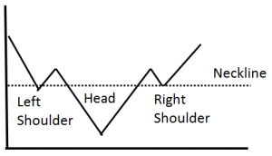
1) Chart Pattern: Head-and-shoulders
The head-and-shoulders pattern is one of the most popular and reliable chart patterns in technical analysis. As its name suggests, the chart pattern looks like a head atop a pair of shoulders. Figure 5 shows a bearish head-and-shoulders pattern. A peak is reached followed by a quick decline (the left shoulders), a higher peak with a greater decline (the head), and finally the right shoulder which is similar to the left. Once you see the right shoulder developing, technical analysis suggests you should place a “put” (down) option, as the asset’s price is likely to fall.
2) Chart Pattern: Inverse Head-and-shoulders
The inverse head-and-shoulders chart pattern (Figure 6) is the exact opposite of the head-and-shoulders top. It signals that the security is about to make an upward move. The inverse head-and-shoulders chart pattern typically comes at the end of a downtrend. It is considered a reversal pattern due to the fact that the security usually heads upwards after the completion of the pattern.
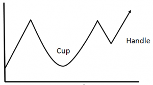
3) Chart Pattern: Cup-and-handle
Figure 7 on the right is a cup-and-handle pattern, given how it resembles the shape of a tea cup. This is a bullish continuation pattern where the upward trend has paused, and traded down, but will continue in an upward direction upon completion of the pattern. Once you’ve spotted a “cup” in the graph, and price begins to level out into a “handle,” technical analysis suggests it is time to place a call option on the asset, for a breakout is on the way.
Wrapping It Up
As we can see, technical analysis comprises of many aspects such as candlesticks and trends. All this information will be helpful to you whether you are a new trader or an experienced one. At Valour, we believe in providing all traders with all the tools they need to be prepared for whatever the markets may bring. This is why we have brought to the table what we think is important to know about both fundamental analysis and technical analysis.
To sum it up, both fundamental analysis and technical analysis are methods every trader can use to inform their decisions in the financial markets. As a trader, you now have access to the pros and cons of both methods and can adopt the one that better suits your needs—or better yet, a blend of the two so you may bring your best strategies to the markets. Learn more about Fundamental Analysis here.